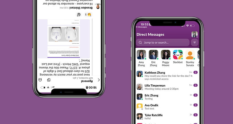
Slack App Redesign
PROJECT TYPE
Solo concept challenge
DURATION
2 days
TOOLS
Figma, Adobe Illustrator, Pen and Paper
METHODS
Market Research, Wireframing, User Experience Design, Interaction Design
Overview: A design proposal for Slack for the iOS that streamlines the notification and messaging experience for users to better adjust communication and organizing files.
Table of Contents
1. Introduction
2. Research
3. Opportunities to Improve
4. Problem Statement
5. Solution Ideation
6. Next Steps and Lessons learned
Introduction
Background Context:
Slack is a team communication company that has led the emergence of the modern company workplace (along with its competitors Microsoft Teams, Google Chats, Discord, etc.) - one that is headquartered in a cloud rather than in a skyscraper. This trend has been accelerated by the COVID-19 pandemic and the rise of remote work. Having been acquired by Salesforce in 2021 for $27.7 billion, the leading customer relationship management tool (CRM), Slack plans to integrate with Salesforce’s pre-existing services in audience data management and AI.
My Experience with Slack:
I was first introduced to Slack as a Staff Writer for my high school journalism class. As someone who became Editor-in-Chief by her senior year, I rapidly became glued to the app. The app has become central to my work, allowing for much quicker, streamlined communication than email, yet still more formal than text messages. It allowed us to get publications churned out, especially during tight deadlines and during COVID-19, and later - as I later entered my college years - to connect with communities I would have otherwise not been able to.
Although its UI is already very well designed, I wonder - is there any way I could improve its mobile application more?
Note: Given I am participating in a rigorous study abroad program and my time constraint of 2 days, I was unable to conduct major user research. I instead focused on my personal experience as a long-term user of the app.


Research
Current Design Analysis
Before diving into my project, I want to first explain Slack basics – this might help with explaining many of the changes that I wanted to bring up. For every organization, company, or community that you are part of, Slack has a “workspace” that is individual “channels.” Channels can be created by the creator of the workspace, and can be designated for specific topics (such as “#sports” for all members to talk about sports, or #julyproject” specifically for members working on a July project). A user has the ability to update notifications settings for an entire workspace and update a specific channel’s notifications settings.
Slack's Recent Update
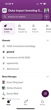
Slack has also recently gone through a major update in September 2023. The biggest differences between the new version and the previous version is the condensed number of tabs in the bottom menu and the new “catch-up” window in the home screen.
-
The new “Activity” tab consolidates Mentions, Threads, Reactions, and Apps into one section.


Before the update, there were 5 tabs (Home, DM, Mention, Search, and You). Now, there are 3 tabs (Home and DM are still there, but everything else is condensed into Activity).
2. The new “catch-up” window groups all of your unread messages into one slideshow. This means that when you click on it, you can flip through each unread message and categorize them as “Keep Unread” or “Mark Read”. My favorite comparison of this feature is to a Tinder swipe right/left.


When seeing an unread message, a user can swipe left for a blue screen that says “Keep Unread”, or swipe right to a green screen that says “Mark as Read”.
However, many users are not satisfied with these updates, as per reviews on the App store.


User Reviews
To explore these differences further, I then looked through user reviews by combing through the App Store (where it’s rated 3.7 stars), and I noticed a trend surrounding concerns regarding certain features of the new update, which impacted productivity.
While I was unable to issue a survey, I was also able to talk to a few fellow users of Slack who were also in my study abroad program. Many of them corroborated what was in these reviews. All of them had struggled with notification organization, DM layouts, and file displacement.
1. Users currently cannot customize the unread notifications from their last opening of the app.
Currently, “Catch Up” section from the top consolidates the number of unreads across all channels and DM. This increases the number of screens that a user must see in order to see which channels and DMs have the unreads. It’s rather overwhelming to flip through multiple screens and decide which to keep read and unread.


To get through all the unread notifications since last opening the app, a user has to tap through multiple screens.
2. The DM tab is simply a list of messages in order of conversations you have last interacted with.
There is no way to prioritize who you talk to most often, which may present an issue. For example, for someone working in HR, and must consistently converse with many people from all divisions on hiring, salary, and any interpersonal conflicts, it becomes confusing to identify important conversations, such as a chat with his/her/their boss. It is difficult to prioritize critical people, such as an important client or senior manager, when someone must carry multiple individual conversations.
3. Finding files, links, and photos in a Slack workspace is very difficult.
Currently, to find a document from a chat, a user must remember the chat and either scroll through days and weeks of messages. This can be very inefficient when trying to identify a file, because it may require sifting through tens or hundreds of messages. If someone scrolls too fast, one may also run the risk of scrolling right past the file they are looking for. Seeking a single document can take a lot of time, effort, and eye strain.
Problem Statement
How might I organize workspaces to better suit a user's priorities, focusing on reading notifications, prioritizing conversations, and finding files to increase overall efficiency?
Solution Ideation
Lo-Fi Wireframing
I first began by sketching prototypes with a pen and paper to quickly visualize our key features and ideas. These were quick drafts used to solicit feedback from stakeholders. Then, I moved on more polished digital wireframes based on the feedback that I heard. I wanted to stay within Slack’s design guidelines to guarantee the app remain intuitive to users.


They’re a little messy, but they do the job of helping me visualize.
Proposed Solutions
Click here to see the Figma file.
1. Organizing notifications based on channel.
To address the many concerns brought on by users at the complexity of the new “Catch Up” feature, I brainstormed ways to organize notifications by channel. Currently in the app, the user can the total number of notifications (under the “Catch Up” section as “# New”), and which channels have new messages. The number of unread messages per channel tells the user which channel has seen the most activity, so I looked into ways to display that number by the name of each channel. The display of this number is inspired by Discord.

An analysis of the original design.
I wanted a solution that would allow the user to see a breakdown of all of their unread conversations - as well as corroborating information such as the number of messages per channel, and a brief overview of who had spoken - in one glance. As per some of the user reviews, swiping through many screens can be complicated and time-consuming, and I believe that all the information from the "Catch Up" section can be condensed into a single screen.

The action of clicking on a channel then allows the user to read their new messages. By going back to their home screen, the bolded unread status has shifted to the regular-thickness, read status, on both the name of the channel and the “Catch Up” section
2. Adding the ability to pin a conversation.
To keep track of important conversations with another user that may be used frequently, I propose adding a “pin” feature to the DMs tab. The “Pin Conversation” feature allows for the user to keep track of important conversations, and prevents a specific chat from being lost in the list of DMs.

An analysis of the original design.
To access this feature, the user can press and hold on the name of the person or group of which they wish to pin. This brings up a menu with various options, which also includes muting notifications, starting a huddle, and viewing profiles. I have added the “Pin Conversation” feature to this menu.

The redesigned menu that appears when you press a conversation now has a "Pin Conversation" menu.
3. Redesigning “Activity” tab to better access files.
One of the things I personally have found most frustrating about the app is the inability to find files such as photos/videos, links, and documents. This can occur especially in industries where content has to be frequently transferred, such as reviewing marketing materials for an advertising agency or updating rounds of edits for a magazine publication. Currently, the only way to find files is by manually scrolling through chats.

An analysis of the original design.
To make organizing files more convenient, I added a “Files” tab in the top menu of the “Activities”. I chose to put this here rather than the “Home” tab because the “Activities” tab is already consolidating and identifying messages with certain features, such as “Mentions” for messages with a mention of the user or “Reactions” for the user’s messages that have been reacted to by others.
The Files tab is divided by photos, documents, and links based on the type of file, and there is a “See more” option that would allow the user to see even more photos than what is displayed on this screen. My design of this feature is inspired by file-storing services, such as Google Drive and Dropbox, where accessing a wide range of files is efficient and convenient.

Being able to find files is crucial to individual and collaborative productivity. Given the lack of an easy file identification system in the mobile app, I redesigned the top bar of the "Activity" tab to include a system for identifying files sent in Slack chats.
Slack Style Guide

Next Steps and Lessons Learned
-
If I had more time, I would work on the animations for the interactions of each Step.
-
Additionally, as measuring success is an imperative part of the design process, I would have tested my final designs with multiple users to see if I have addressed their pain points successfully.
-
Overall, this was an extremely enjoyable design challenge. I loved exploring through Kleiner Perkins’ list of companies, recognizing apps that I used, and figuring out ways to include them. I am incredibly grateful for the opportunity to apply to Kleiner Perkins’ Design Fellowship. Thank you for considering my application!